Introduction
The way people browse the internet has changed forever. More than 60% of global web traffic now comes from mobile devices according to Statista, and Google has shifted to mobile-first indexing — meaning your mobile site is the version Google uses to rank your business.
For companies in Frisco and across North Texas, that means your website isn’t just competing on looks — it’s competing on mobile performance, user experience, and voice search visibility. At Frisco Web Design, we build responsive, mobile-first sites that keep you ahead of the competition.
Mobile-First = Search First
In 2019, Google officially switched to mobile-first indexing, and by 2025, there’s no going back. If your site doesn’t perform flawlessly on mobile devices, it won’t just frustrate visitors — it will directly hurt your rankings.
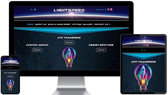
A responsive website adapts seamlessly to every screen size — from desktops to tablets to smartphones. This ensures that no matter how your customers are searching, they get a fast, clean, and easy-to-navigate experience.
Why Responsiveness Matters for SEO and AEO
SEO today isn’t just about keywords — it’s about how well your site serves visitors. Google rewards responsive sites with better rankings because they deliver:
- Faster load times
- Lower bounce rates
- Higher engagement
But it’s not just Google. Answer Engines like Siri, Alexa, and ChatGPT increasingly pull results from sites that are mobile-friendly and optimized for structured data. A site that works perfectly on mobile is more likely to surface in voice and AI-driven queries.
As Search Engine Journal points out, mobile-first indexing has made responsive design not just an option, but a requirement for online visibility.
The User Experience Advantage
A responsive site isn’t just for Google — it’s for your customers. When visitors land on a site that looks broken, loads slowly, or forces them to pinch and zoom, they leave. A site that adapts instantly builds trust, keeps people engaged, and increases conversions.
According to HubSpot, mobile-friendly websites reduce bounce rates and improve engagement because users expect a smooth, app-like experience when browsing.
Preparing for the Future: Voice and AI Search
By 2025, more than 50% of online searches are projected to come from voice queries. Answer Engines like Siri, Alexa, and ChatGPT prefer sites that load fast and adapt well on mobile devices because that’s where users are searching.
That means responsive design is no longer just about user experience — it’s about future-proofing your visibility across search platforms.
FAQs
Q: What is responsive web design?
A: Responsive web design is the practice of creating a website that automatically adjusts its layout and functionality to fit different devices and screen sizes, from desktops to smartphones.
Q: Why does Google prioritize mobile-first websites?
A: Since most users now search on mobile devices, Google uses the mobile version of your website as the primary version for indexing and ranking. This ensures that search results reflect the experience most users will see.
Q: How does responsive design help SEO?
A: Responsive design improves SEO by providing a consistent user experience, reducing bounce rates, and improving page load times — all of which are ranking signals for Google.
Q: Will responsive design help with voice search?
A: Yes. Voice assistants and Answer Engines prefer mobile-friendly, fast-loading websites because users often make voice searches on mobile devices. Responsive design improves your visibility in these search results.
Conclusion
Responsive web design is no longer a “nice to have.” It’s the foundation of visibility, usability, and growth in today’s digital marketplace. If your business site isn’t mobile-first, you’re already falling behind competitors who are.
At Frisco Web Design, we specialize in building responsive, mobile-first websites that rank higher, convert more visitors, and position your business for success in the age of Google, Siri, Alexa, and AI-driven search.

