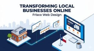
By Frisco Web Design
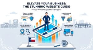
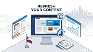
The internet changes rapidly. What looked modern five years ago now looks outdated to the average consumer. In a booming economic hub like Frisco, Texas, local companies must keep their online presence fresh and engaging. As consumer expectations shift, the visual presentation of your business must adapt to meet those new demands. A static, basic layout no longer captures the attention of potential clients shopping online or looking for local services near Stonebriar Centre or The Star. The visual presentation of your brand must actively engage the user the absolute second the page loads.
The team at Frisco Web Design constantly monitors data, technical advancements, and consumer behavior to see exactly what works right now. We have compiled this highly detailed guide to help local business owners understand the most current design movements. By evaluating these trends, you can make informed decisions about updating your own site and staying ahead of local competitors in Collin County.
The Dominance of Purposeful Minimalism
Minimalism is not just about having less on the screen. It involves stripping away visual distractions so the visitor focuses entirely on your core message and your products. In the past, sites were cluttered with complex sidebars, annoying pop-ups, and incredibly dense paragraphs of text. Now, the focus rests entirely on visual clarity. A minimalist approach uses intentional blank space, large imagery, and incredibly direct copywriting. This method directly improves the speed of your site because there are fewer heavy elements for the server to load. Fast sites rank better on search engines and keep visitors engaged much longer.
To implement purposeful minimalism effectively, focus on these specific tactics:
- Intentional Blank Space: Leaving empty room around text and images gives the eyes a place to rest. This strategy, often called white space, makes your most important calls to action stand out immediately without fighting for attention.
- Hidden Navigation Menus: Many modern sites use hamburger menus even on standard desktop layouts. This hides the navigation links until the user specifically clicks the menu icon, keeping the main screen completely clean and highly focused.
- Restricted Color Palettes: Sticking to a strict palette of two or three primary colors prevents visual exhaustion. It also keeps your corporate branding highly consistent across every single page.
- Direct Messaging: Minimalist design forces you to write better copy. You must explain your exact value in three sentences instead of three massive paragraphs, making your pitch much more effective.
The Permanent Rise of Dark Mode Aesthetics
Dark mode started as a simple operating system feature, but it has completely taken over standard web layouts. Users love dark backgrounds because they reduce eye strain, especially when browsing at night or in low-light environments. Furthermore, dark layouts can actually save battery life on modern mobile devices. From a visual perspective, dark backgrounds make bright accent colors and high-quality photographs pop off the screen with incredible intensity. When a user visits a dark-themed site, it often feels more premium, sophisticated, and memorable.
Consider these elements when designing a dark mode layout:
- User Preference Toggles: Giving the visitor a button to switch between light and dark versions of your site provides an excellent experience. People appreciate having direct control over how they view your content.
- High-Contrast Text: Using stark white or soft gray text on a deep navy or black background makes reading incredibly easy and prevents the text from blending into the shadows.
- Emotional Impact: Darker tones naturally convey a sense of luxury and exclusivity. This aesthetic works perfectly for high-end Frisco restaurants, corporate law firms, and boutique retail shops.
- Vibrant Accent Colors: A neon blue or bright orange call-to-action button stands out significantly more on a dark background than it does on a traditional white page, naturally drawing the eye and encouraging clicks.
Engaging Visitors with Subtle Micro-Interactions
Small visual animations can make a website feel incredibly alive. We call these subtle movements micro-interactions. They provide instant visual feedback to the user without overwhelming the screen or slowing down the loading process. When someone hovers their mouse over a button, that button might slightly change color or gently expand. When a user submits a contact form, a small animated checkmark might appear. These tiny details assure the visitor that the website is working correctly and actually responding to their physical inputs.
You can incorporate micro-interactions using the following methods:
- Hover Effects: Changing the appearance of a link or an image when the cursor rests on it encourages the user to click and explore the page further.
- Scrolling Animations: As a visitor scrolls down the page, text boxes or images can gently fade into view. This keeps the reading experience dynamic and visually interesting, preventing the user from getting bored.
- Custom Loading Indicators: If a specific page or large image requires a few seconds to load, a custom animated logo keeps the user entertained and prevents them from hitting the back button.
- Interactive Data Displays: Displaying pricing or local Frisco real estate statistics with animated charts engages the logical side of the brain and makes boring numbers highly engaging.
Oversized Typography as the Primary Visual Focus
Words are no longer just for reading. They act as massive structural design elements. One of the biggest shifts we see involves bold, oversized typography dominating the top half of the homepage. Instead of relying on a giant photograph to tell the story, designers are using huge fonts to make a highly specific, text-based statement. This approach communicates your core message the absolute second the page loads. When executed correctly, oversized text creates a striking, modern look that demands attention. It leaves absolutely no doubt about what your company does and who you serve in the local area.
To utilize oversized typography correctly, remember these guidelines:
- Custom Corporate Fonts: Brands are moving away from standard, boring fonts and choosing unique typefaces that perfectly reflect their personality and corporate identity.
- Text-Heavy Hero Sections: The top section of the website often features just three or four massive words on a solid background, creating immediate intrigue without the need for complex photography.
- Kinetic Typography: This refers to text that actually moves or changes shape as the user interacts with the page, grabbing visual attention and holding it firmly.
- Readability First: Even when fonts are massive and artistic, they must remain entirely readable on small phone screens. The letters must never overlap in a way that makes the words confusing.
Designing Specifically for the Mobile Thumb
We all know that mobile layouts hold incredible importance. However, the approach to mobile design has shifted specifically toward how people actually hold their phones. Most people use one hand and scroll with their thumb. This physical reality has forced designers to rethink exactly where they place critical buttons and navigation links. If a menu is located at the absolute top left corner of a large smartphone, a user has to stretch their thumb uncomfortably or use two hands to tap it. Modern mobile layouts are moving the most important interactive elements to the bottom of the screen, right where the thumb naturally rests.
Ensure your mobile layout includes these thumb-friendly features:
- Bottom Navigation Bars: Similar to popular mobile applications, many websites now feature a sticky menu at the very bottom of the screen for incredibly fast access.
- Strategic Thumb Zones: Important call-to-action buttons are placed in the center or lower half of the screen, completely avoiding the hard-to-reach top corners.
- Swipe Gestures: Allowing users to swipe left or right to view different project galleries or read client testimonials feels entirely natural on a modern touchscreen device.
- Large Tap Targets: Every button and link must be large enough to tap easily without accidentally hitting a neighboring link, preventing user frustration.
Prioritizing Deep Web Accessibility Standards
Making your website accessible to everyone, including individuals with disabilities, is no longer an optional feature. It is a fundamental requirement for modern businesses. Accessibility trends focus on ensuring that people with visual, auditory, or motor impairments can interact with your content easily. This involves proper structural coding that allows screen-reading software to dictate the text to a blind user. It also requires careful consideration of color pairings so that colorblind individuals can read the content without struggling. Building an accessible site broadens your audience and demonstrates that your Frisco business cares deeply about the entire community.
Implement these vital accessibility standards into your digital presence:
- Strict Contrast Ratios: Designers must ensure that text colors contrast sharply against background colors, making paragraphs highly legible for everyone regardless of visual ability.
- Descriptive Alternative Text: Every single image on the site must contain a hidden written description so that assistive technologies can explain the picture to visually impaired visitors.
- Keyboard Navigation Options: The entire website must be fully navigable using only the Tab and Enter keys on a keyboard, catering strictly to users who cannot operate a computer mouse.
- Clear Form Labels: Contact forms must explicitly state what information is required in each box, avoiding confusing placeholder text that disappears when the user starts typing.
Immersive Elements and Visual Layering
As web browsers become more capable and internet speeds increase globally, designers can include complex visual features that used to be impossible. Multi-layered illustrations and overlapping elements bring an incredible sense of depth to a flat computer screen. These elements do not have to be overwhelming to be effective. Background shapes that move at different speeds as the user scrolls create a highly memorable experience. This technique, known as parallax scrolling, gives the illusion of physical depth. When you combine deep layers with crisp graphics, your website feels like a premium, interactive environment rather than a basic digital flyer.
Add depth to your website using these layering techniques:
- Parallax Backgrounds: Background images move slower than foreground text during scrolling, providing a highly engaging, three-dimensional visual effect.
- Soft Drop Shadows: Applying gentle shadows behind text boxes or images makes those specific elements appear to float slightly above the main page layout, establishing a clear visual hierarchy.
- Overlapping Grid Layouts: Breaking away from perfectly aligned, rigid boxes and allowing images to slightly overlap text boxes creates an artistic, modern aesthetic.
- Layered Vector Illustrations: Stacking custom graphics on top of each other creates a sense of physical space and makes the design feel incredibly robust and detailed.
Conclusion
The visual layout of your online presence heavily dictates how the local market perceives your brand. Implementing the latest aesthetic and functional trends proves that your business operates at the highest level of professionalism. From embracing ultra-minimalism and dark mode aesthetics to prioritizing mobile thumb-friendliness and strict accessibility, these strategies provide a superior experience for your visitors. A modern, engaging website keeps people reading your content longer, builds absolute trust, and ultimately guides them toward contacting your office.